Here are my personal work and practice design projects
Obsession Movie (2026) Fan Art

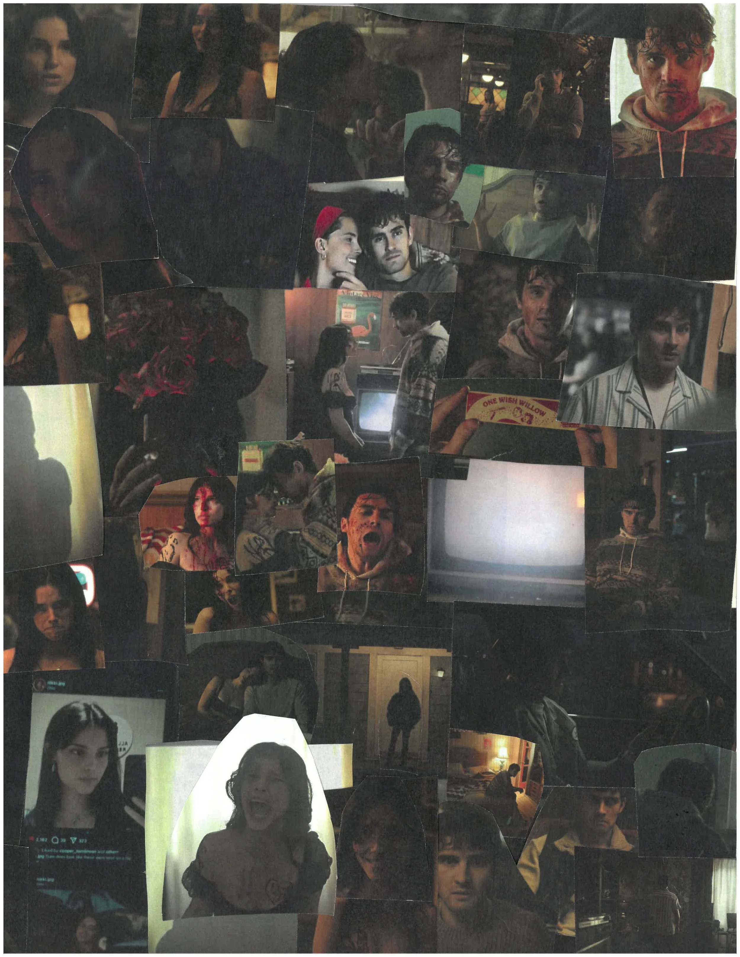

Obsession movie fan art, handmade collage created using cut-out images and glue, featuring handwritten text painted in red, a heart, and splatter effects.
Disclaimer: I do not own any rights to the movie Obsession. This artwork was created as fan art for personal appreciation and is not affiliated with or endorsed by the filmmakers. No AI was used.

Health & Animal Product Campaign
(Design practice)
Design 1: Allergyyy: Pet Allergy Skin Relief — Editorial & Brand Concept
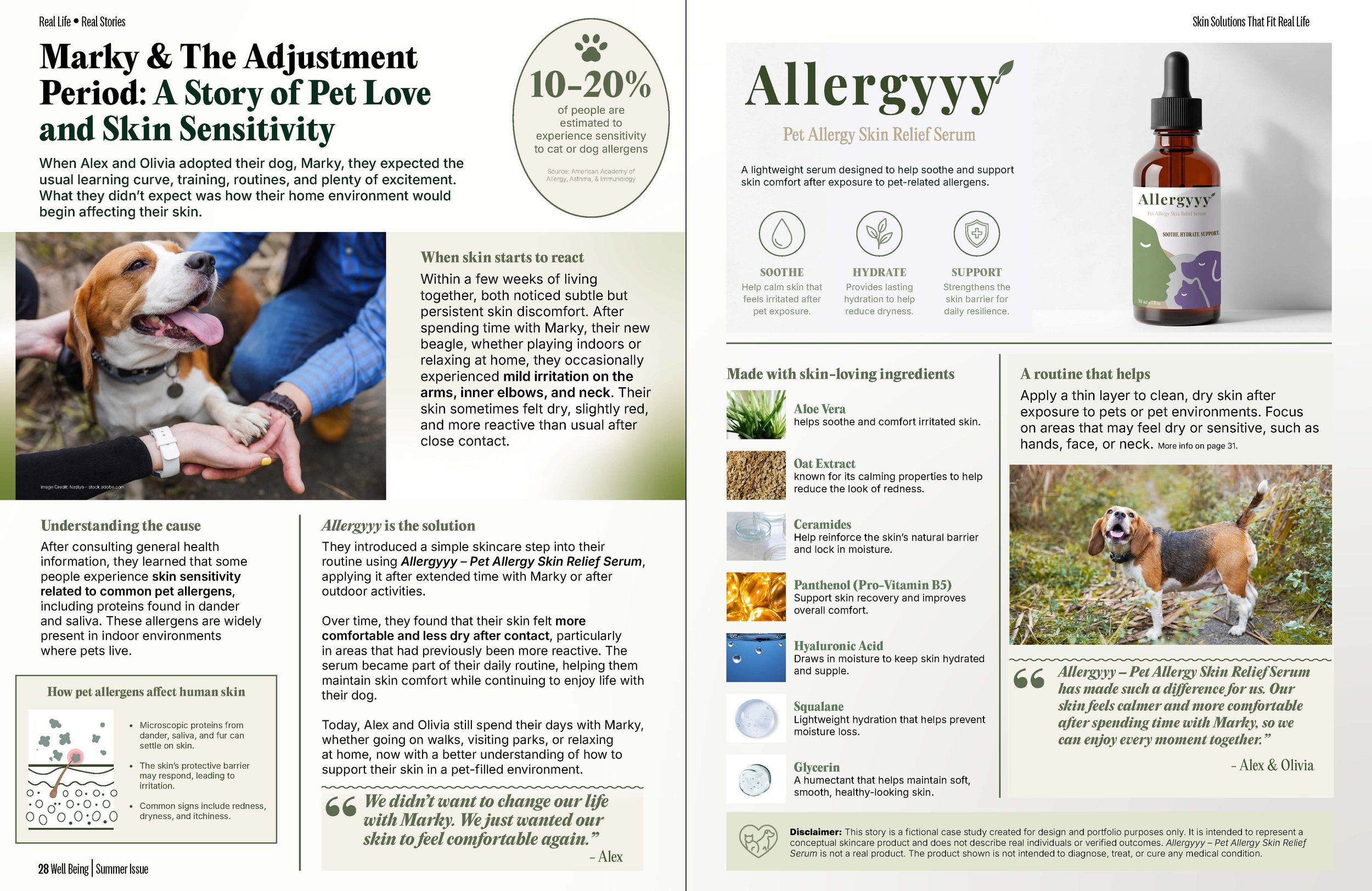
This project is a conceptual design exploration that combines editorial layout, brand identity, and product visualization within a unified skincare narrative. It examines how pet-related environmental allergens can affect skin sensitivity and translates that topic into a clean, consumer-friendly visual story.
The work includes:
Editorial design: A two-page magazine-style spread focused on typography, hierarchy, and storytelling
Infographic elements: Simplified, science-informed visuals explaining how pet allergens interact with skin
Logo and identity creation: Development of the Allergyyy brand, including naming, tone, and visual direction
Product packaging and mockups: A serum concept brought to life through realistic label design and product visualization
A key focus of this project was designing for content-heavy layouts, where a large amount of text needed to be clearly organized and presented within a limited two-page spread. This required careful attention to readability, spacing, hierarchy, and visual balance to ensure the information remained engaging and easy to navigate.
Together, these components demonstrate how a concept can evolve from insight → narrative → brand → product experience.
This project represents a sample editorial spread and design system, not a full magazine or product launch.
Disclaimer: This project is a fictional concept created for portfolio purposes only. It does not represent real individuals, events, or verified outcomes. Allergyyy – Pet Allergy Skin Relief Serum is not a real product, and the content is not intended to diagnose, treat, or cure any medical condition.
Campaign designs: 2 & 3
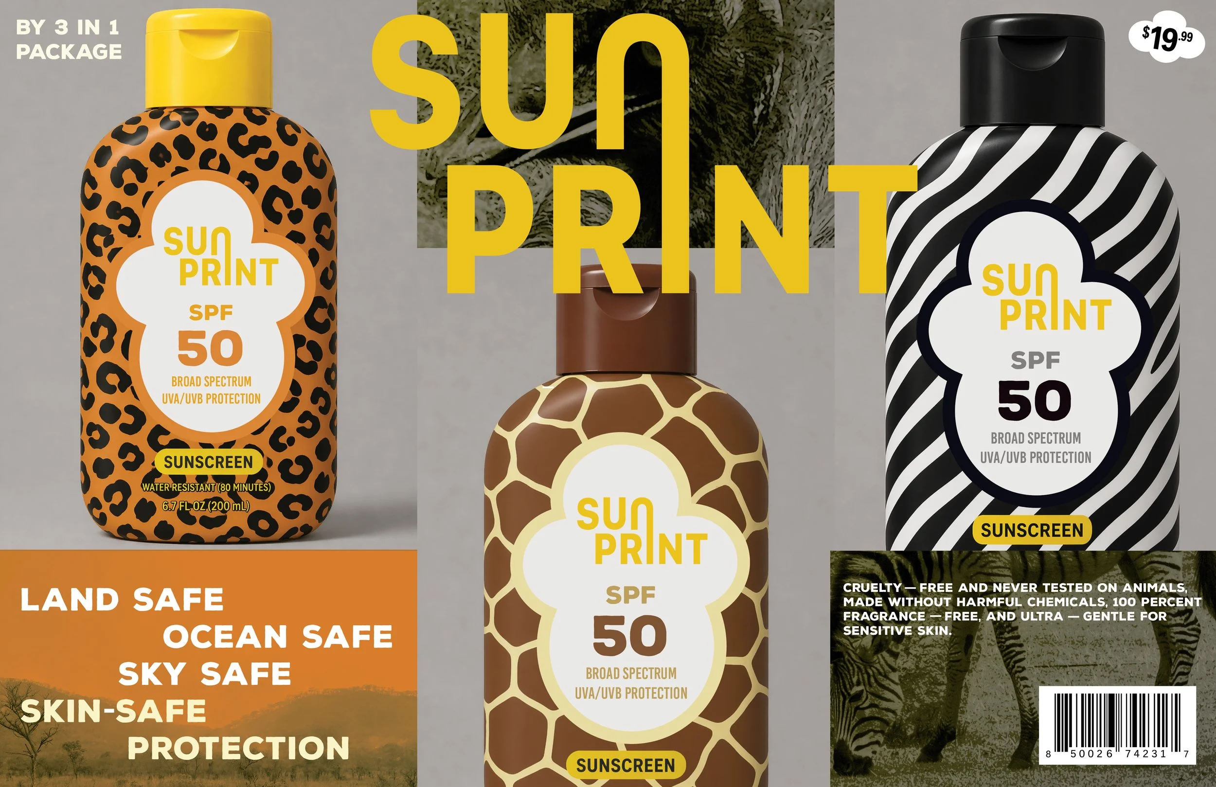
Sunscreen protection packaging
A conceptual sunscreen packaging design that explores a bold animal-print aesthetic, visually connecting product performance with themes of nature and protection. Select design elements were developed with the assistance of AI as part of an exploratory creative process. This project is a fictional concept created for portfolio purposes only.
No Animal Testing in our Health Products (graphic)
This concept explores ethical product development, reflecting the industry’s shift toward effective, non-animal testing methods that don’t compromise safety or innovation.
Designed for flexibility, the graphic can be used across digital platforms, from blog covers to social media, to convey a clear, cruelty-free message.

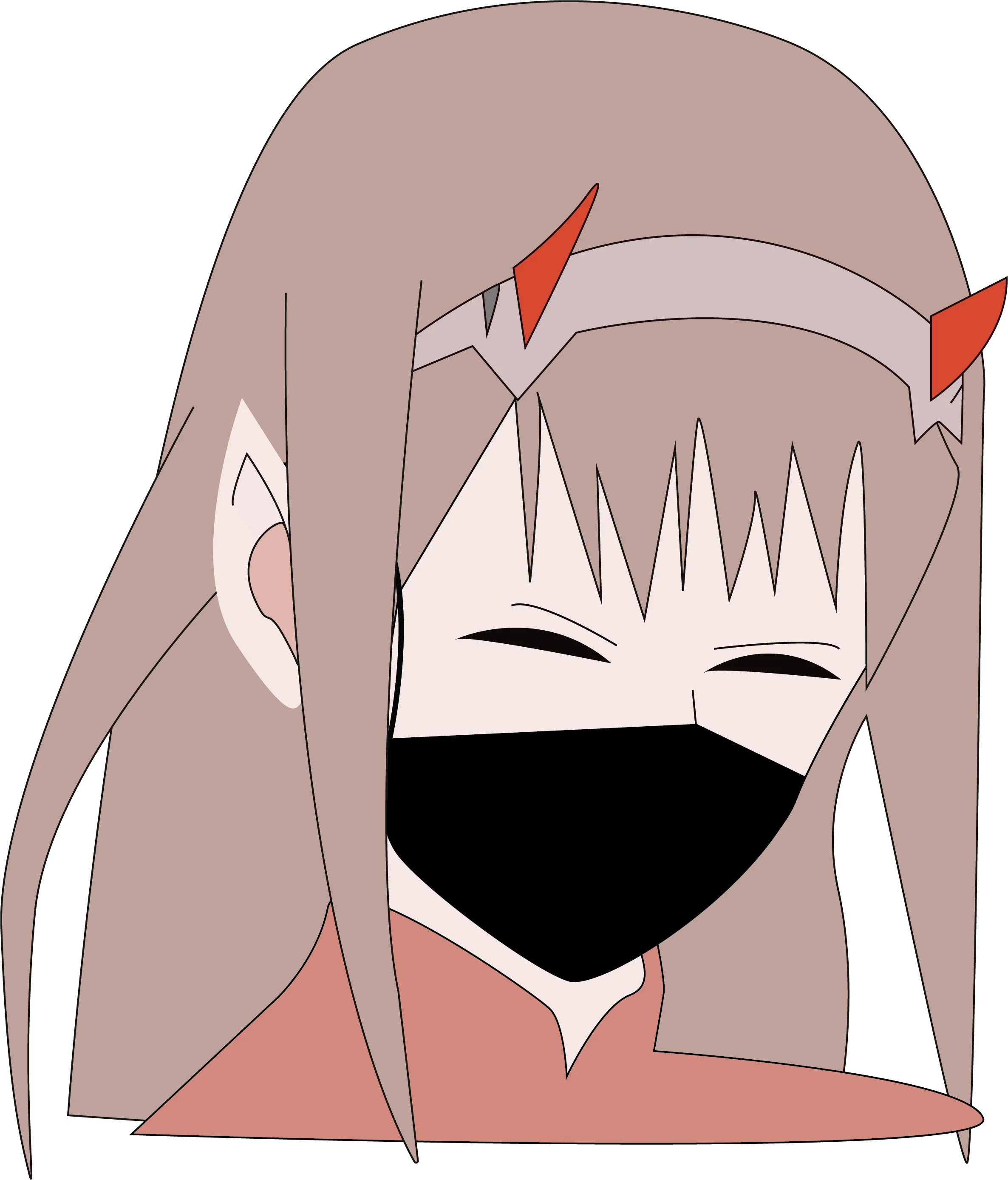
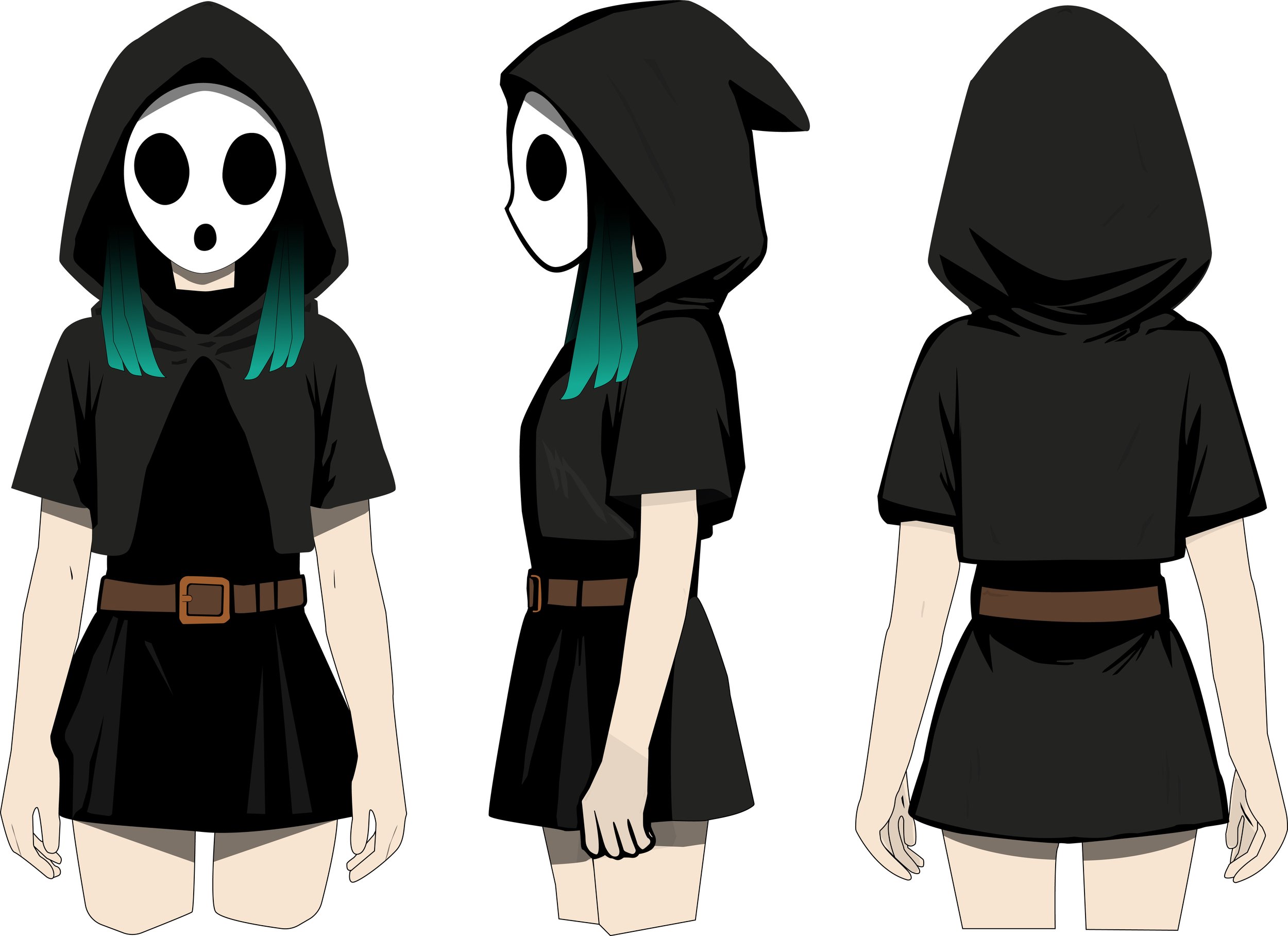
Illustration/manga practice
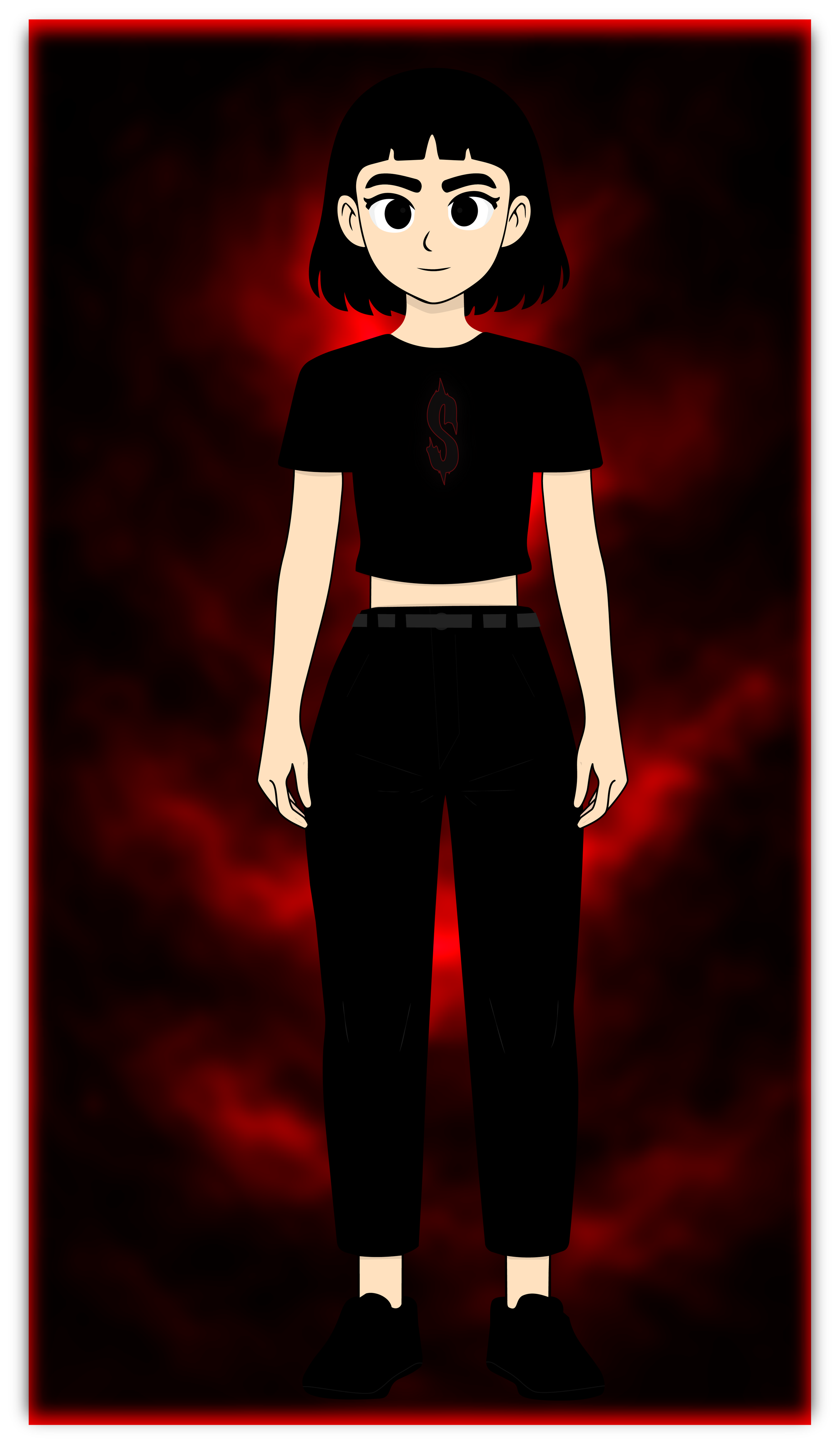

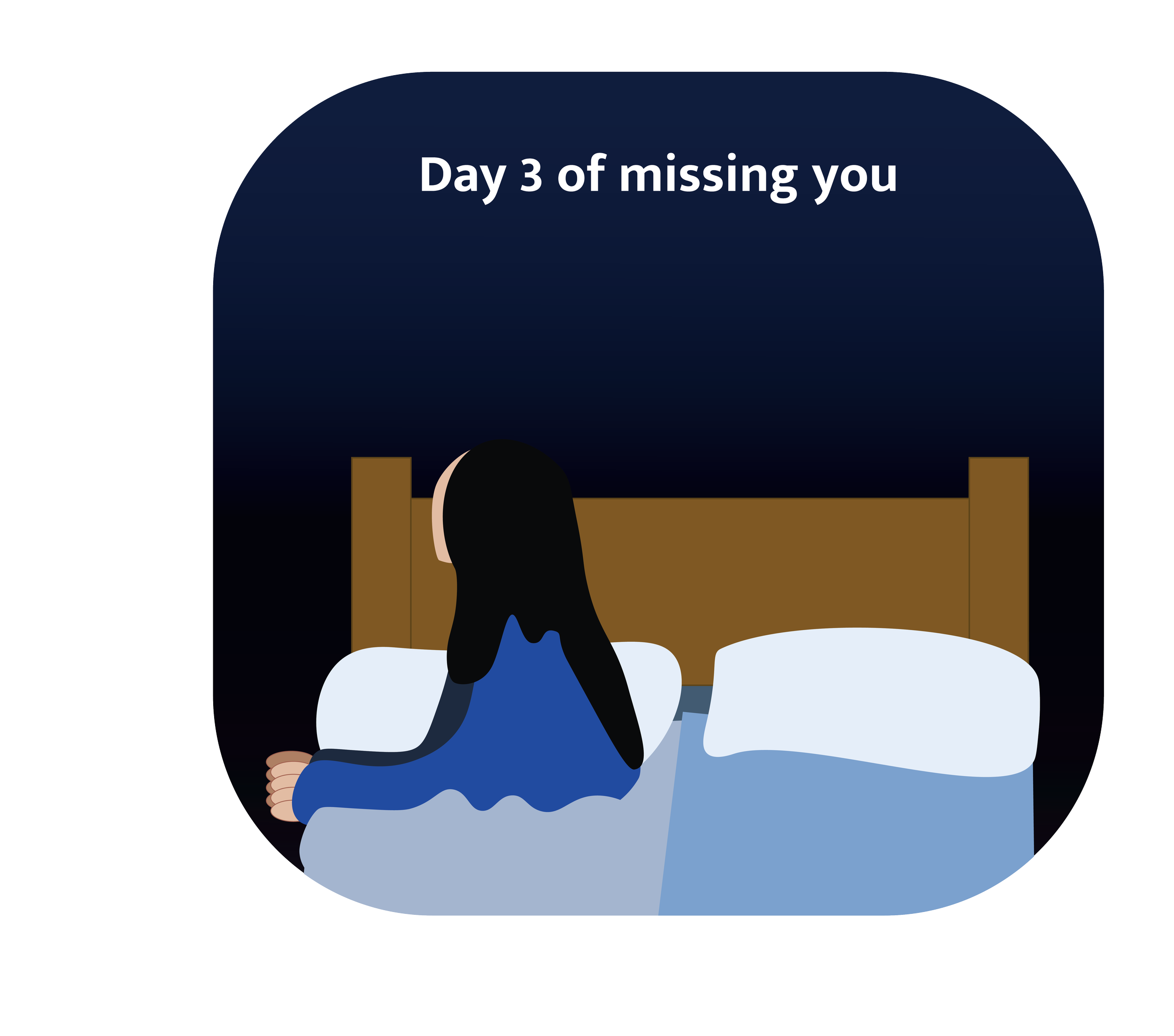
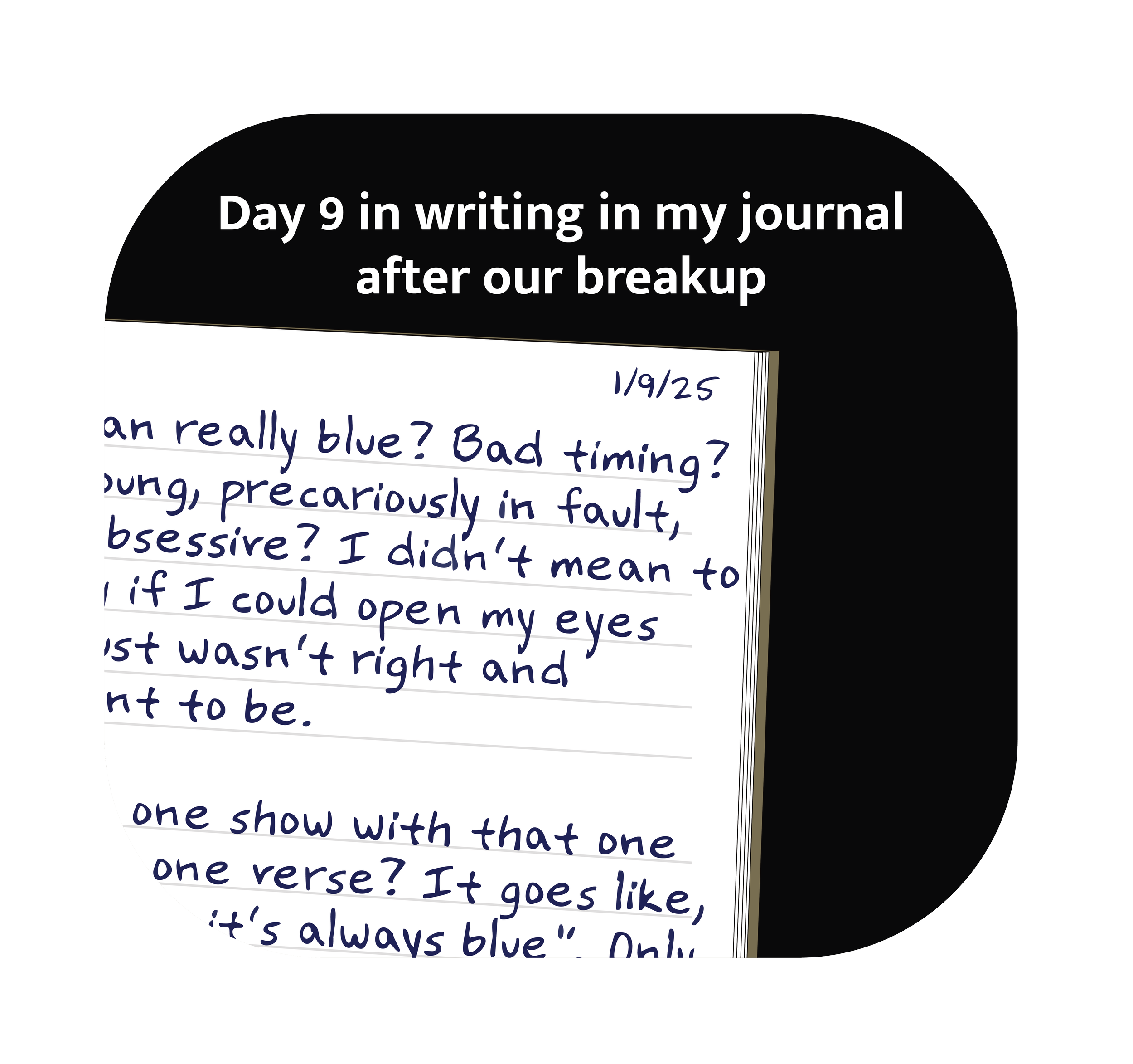
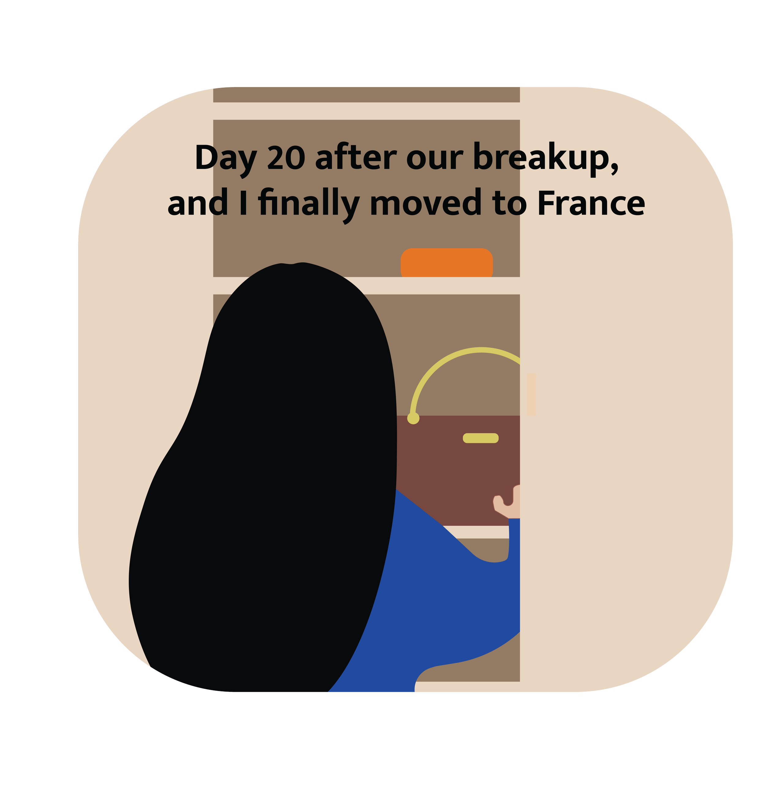
Days after our breakup graphic
Day 20 after our breakup, I finally moved to France.
This personal narrative-driven design project explores the themes of transition, healing, and self-reinvention. The title marks a specific moment in time, using Day 20 to emphasize emotional distance from the breakup while highlighting the courage and finality of a major life change.
The project uses storytelling as a design tool, capturing the tension between loss and renewal. The breakup represents an ending, while moving to France symbolizes escape, growth, and the deliberate choice to begin again. By anchoring the project to a precise day, the work reflects that emotional recovery is not abstract but measured, lived, and intentional.
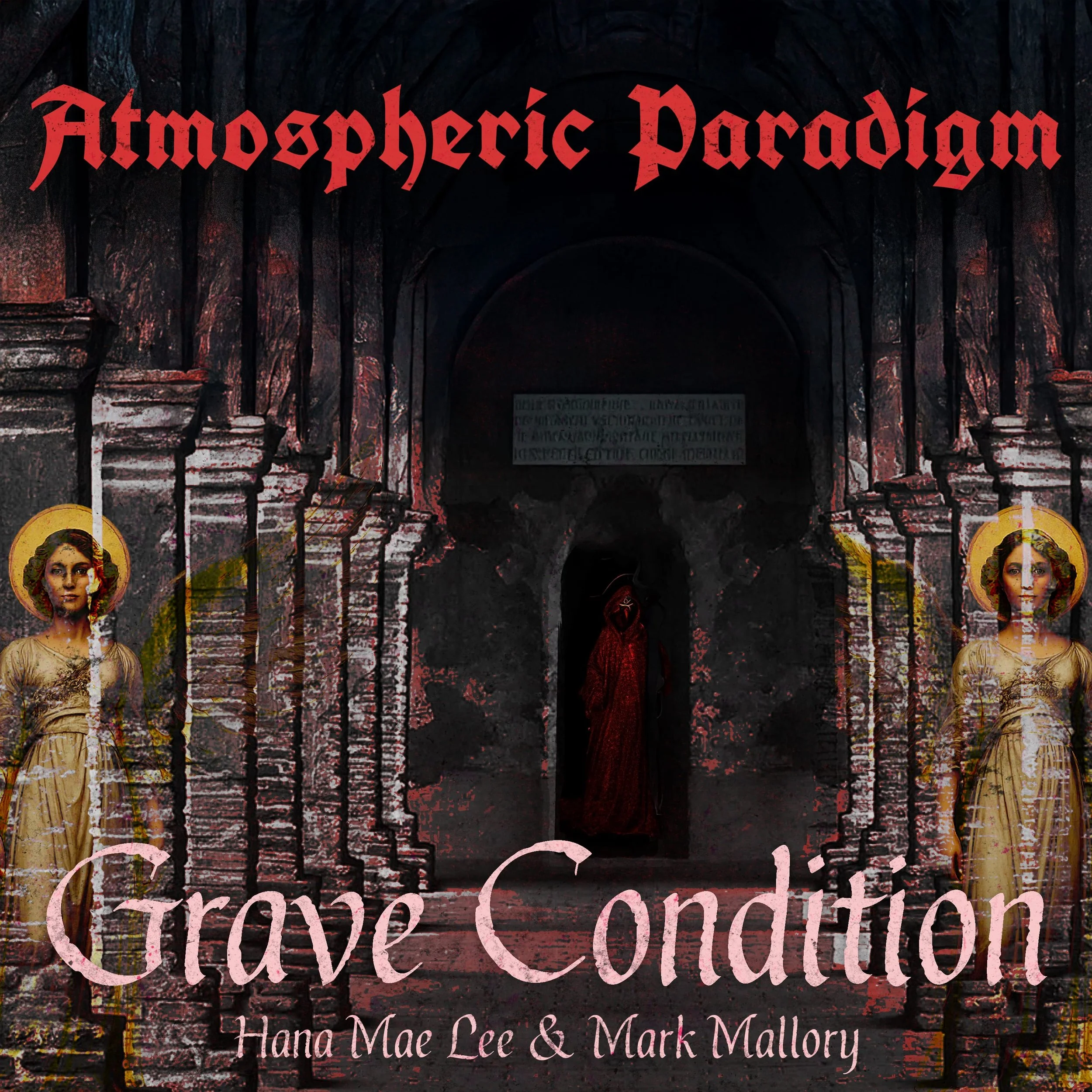
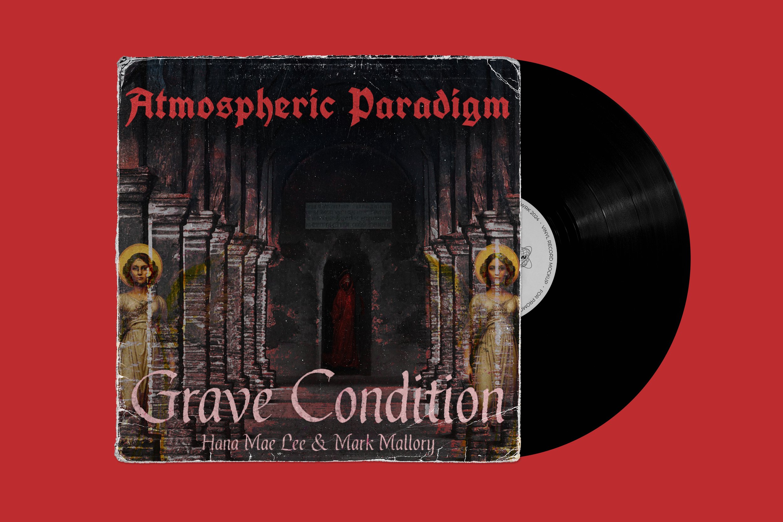
Atmospheric Paradigm — Grave Condition (Fan Art)
This fan art was created as a visual response to Atmospheric Paradigm by Grave Condition. The piece interprets the album’s themes of emotional weight, isolation, and tension between the internal and external world. Through layered textures, stark contrasts, and an atmospheric color palette, the design reflects the record’s immersive and haunting soundscape.
The composition leans into a sense of unease and introspection, mirroring how the album builds mood rather than narrative—allowing space for ambiguity, distortion, and feeling. Select elements were enhanced using AI-assisted tools as part of an experimental visual process, reinforcing the album’s blend of human expression and synthetic atmosphere.
The artwork was shared with the band, and Hana Mae Lee personally acknowledged the piece, making the project a meaningful exchange between artist and audience and a testament to how music can inspire cross-disciplinary creative interpretation.
Some elements were made with AI.